
1 线性布局
LinearLayout
// 布局方向
orientation="vertical/horizontal"
// 子元素的对齐方式
gravity="left|buttom"
// 控制该组件在父容器的对齐方式
layout_gravity

// 权重,将剩余部分等比划分
weight

// 分割线图片
divider
// 设置分割线位置,none/middle/begining/end
showDividers
// 分割线 padding
dividerPadding
当 android:orientation=“vertical” 时, 只有水平方向的设置才起作用,垂直方向的设置不起作用。 即:left,right,center_horizontal 是生效的。 当 android:orientation=“horizontal” 时, 只有垂直方向的设置才起作用,水平方向的设置不起作用。 即:top,bottom,center_vertical 是生效的。
weight 权重
将剩余空间按权重划分。
当 width 为 0dp 或者 wrap_content 的时候没有问题。
当子控件 width 为 match_parent 会出现问题
// 控件1
android:layout_weight="1"
android:layout_width="fill_parent"
// 控件2
android:layout_weight="2
android:layout_width="fill_parent"
// 控件3
android:layout_weight="3
android:layout_width="fill_parent"
发现比例为 2:1:0 ,
step 1:个个都是fill_parent,但是屏幕只有一个啦,那么1 - 3 = - 2 fill_parent
step 2:依次比例是1/6,2/6,3/6
step 3:剩余空间为 -2 fill_parent,先到先得,先分给one,计算: 1 + (- 2 * (1/6)) = 2/3 fill_parent ,接着到two,计算: 1 + ( - 2 * (2/6)) = 1/3 fill_parent, 最后到three,计算 1 + ( - 2 * (3/6)) = 0 fill_parent
2 相对布局
RelativeLayout
可以相对于某一控件或者父容器对齐
所有控件从左上角开始
基本属性
// 设置容器内组件的对齐方式
gravity
设置了该属性为true的属性的组件,将不受 gravity 属性的影响
ignoreGravity
根据父容器定位
// 左对齐
layout_alignParentLeft
// 右对齐
layout_alignParentRight
// 顶部对齐
layout_alignParentTop
// 底部对齐
layout_alignParentBottom
// 水平居中
layout_centerHorizontal
// 垂直居中
layout_centerVertical
// 中间位置
layout_centerInParent
根据兄弟组件定位
// 参考组件的左边
layout_toleftOf
// 参考组件的右边
layout_toRightOf
// 参考组件的上方
layout_above
// 参考组件的下方
layout_below
// 对齐参考组件的上边界
layout_alignTop
// 对齐参考组件的下边界
layout_alignBottom
// 对齐参考组件的左边界
layout_alignLeft
// 对齐参考组件的右边界
layout_alignRight
margin 偏移
// 设置组件上下左右的偏移量
layout_margin
// 设置组件离左边的偏移量
layout_marginLeft
// 设置组件离右边的偏移量
layout_marginRight
// 设置组件离上面的偏移量
layout_marginTop
// 设置组件离下面的偏移量
layout_marginBottom
padding 填充,padding 会影响组件自身大小
// 往内部元素的上下左右填充一定边距
padding
// 往内部元素的左边填充一定边距
paddingLeft
// 往内部元素的右边填充一定边距
paddingRight
// 往内部元素的上方填充一定边距
paddingTop
// 往内部元素的下方填充一定边距
paddingBottom
3 帧布局
FrameLayout
只能放在(top,center,bottom)*(left,center,right) 9 个位置
// 前景图像:永远处于帧布局最上面,直接面对用户的图像,就是不会被覆盖的图片。
// 设置改帧布局容器的前景图像
foreground
// 设置前景图像显示的位置
foregroundGravity
// 指定控件的对齐方式
android:layout_gravity="bottom"
android:layout_gravity="center_vertical"
// 垂直居中并靠右
android:layout_gravity="center_vertical|right"
4 表格布局
TableLayout 不常用,类似于竖直方向的线性布局
<TableRow> :声明控件在一行
确定行数和列数
- 如果我们直接往 TableLayout 中添加组件的话,那么这个组件将占满一行!!!
- 如果我们想一行上有多个组件的话,就要添加一个 TableRow 的容器,把组件都丢到里面!
- tablerow 中的组件个数就决定了该行有多少列,而列的宽度由该列中最宽的单元格决定
- tablerow 的 layout_width 属性,默认是 fill_parent 的,我们自己设置成其他的值也不会生效!!! 但是 layout_height 默认是 wrapten-content的,我们却可以自己设置大小!
- 整个表格布局的宽度取决于父容器的宽度(占满父容器本身)
- 有多少行就要自己数啦,一个 tablerow 一行,一个单独的组件也一行!多少列则是看 tableRow 中的组件个数,组件最多的就是 TableLayout 的列数
常用属性
// 设置需要被隐藏的列的序号
collapseColumns
// 设置允许被收缩的列的列序号,为了保证表格能适应父容器的宽度
shrinkColumns
// 设置运行被拉伸的列的列序号,填满剩余空间
stretchColumns

以上这三个属性的列号都是从 0 开始算的,比如 shrinkColunmns = "2",对应的是第三列!
可以设置多个,用逗号隔开比如"0,2",如果是所有列都生效,则用"*"号即可
除了这三个常用属性,还有两个属性,分别就是跳格子以及合并单元格,这和HTML中的Table类似:

// 表示的就是跳过第二个,直接显示到第三个格子处,从1开始算的!
layout_column="2"
// 表示合并4个单元格,也就说这个组件占4个单元格
android:layout_span="4"
5 网格布局
GridLayout
使用虚细线将布局划分为行、列和单元格,也支持一个控件在行、列上都有交错排列。
// 排列方式
orientation="vertical/horizontal"
// 对齐方式
gravity="center/left/right/bottom"

// 布局的行列数
rowCount="4"
columnCount="4"

// 组件起始行列
layout_row="1"
layout_column="2"

// 组件跨越行列数
layout_rowSpan="2"
layout_columnSpan="3"
设置了组件横跨多行或者多列的话,如果你要让组件填满横越过的行或列的话,需要添加下面这个属性: layout_gravity = “fill”
绝对布局
AbsoluteLayout 已过时
// 设置组件的X坐标
layout_x
// 设置组件的Y坐标
layout_y
6 约束布局
参考:约束布局ConstraintLayout看这一篇就够了
缺点:约束太强,不利于维护,牵一发而动全身
位置约束
// 左边约束在所选控件的左边
layout_constraintLeft_toLeftOf
// 左边约束在所选控件的右边
layout_constraintLeft_toRightOf
layout_constraintRight_toLeftOf
layout_constraintRight_toRightOf
layout_constraintTop_toTopOf
layout_constraintTop_toBottomOf
layout_constraintBottom_toTopOf
layout_constraintBottom_toBottomOf
layout_constraintBaseline_toBaselineOf
layout_constraintStart_toEndOf
layout_constraintStart_toStartOf
layout_constraintEnd_toStartOf
layout_constraintEnd_toEndOf
角度约束
layout_constraintCircle="@+id/TextView1"
layout_constraintCircleAngle="120"(角度)
layout_constraintCircleRadius="150dp"(距离)
margin 约束
layout_marginStart
layout_marginEnd
layout_marginLeft
layout_marginTop
layout_marginRight
layout_marginBottom
约束布局中必须约束一个相对位置 margin 才生效
goneMargin
// goneMargin 主要用于约束的控件可见性,约束控件被设置为 gone 的时候使用的 margin 生效
layout_goneMarginStart
layout_goneMarginEnd
layout_goneMarginLeft
layout_goneMarginTop
layout_goneMarginRight
layout_goneMarginBottom
居中
layout_constraintBottom_toBottomOf="parent"
layout_constraintLeft_toLeftOf="parent"
layout_constraintRight_toRightOf="parent"
layout_constraintTop_toTopOf="parent"
偏移
// 水平偏移
layout_constraintHorizontal_bias="0.5"  // 0 最左侧,1 最右侧
// 垂直偏移
layout_constraintVertical_bias
尺寸约束
minWidth  // 最小的宽度
minHeight // 最小的高度
maxWidth  // 最大的宽度
maxHeight // 最大的高度

// 官方不推荐在 ConstraintLayout 中使用 match_parent,可以设置 0dp
宽高比
layout_constraintDimensionRatio="1:1"
// 已知宽求高,已宽为基准求高
app:layout_constraintDimensionRatio="H,2:3"
// 已知高求宽,已高为基准就宽
app:layout_constraintDimensionRatio="W,2:3"
链
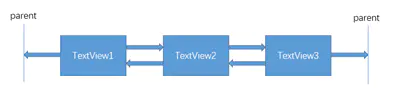
如果两个或以上控件通过下图的方式约束在一起,就可以认为是他们是一条链(图为横向的链,纵向同理)。
用代码表示:
<TextView
        android:id="@+id/TextView1"
        android:layout_width="wrap_content"
        android:layout_height="wrap_content"
        app:layout_constraintLeft_toLeftOf="parent"
        app:layout_constraintRight_toLeftOf="@+id/TextView2" />

<TextView
    android:id="@+id/TextView2"
    android:layout_width="wrap_content"
    android:layout_height="wrap_content"
    app:layout_constraintLeft_toRightOf="@+id/TextView1"
    app:layout_constraintRight_toLeftOf="@+id/TextView3"
    app:layout_constraintRight_toRightOf="parent" />

<TextView
    android:id="@+id/TextView3"
    android:layout_width="wrap_content"
    android:layout_height="wrap_content"
    app:layout_constraintLeft_toRightOf="@+id/TextView2"
    app:layout_constraintRight_toRightOf="parent" />
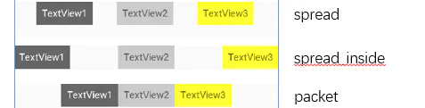
layout_constraintHorizontal_chainStyle 来改变整条链的样式。chains提供了3种样式
CHAIN_SPREAD —— 展开元素 (默认);
CHAIN_SPREAD_INSIDE —— 展开元素,但链的两端贴近parent;
CHAIN_PACKED —— 链的元素将被打包在一起。
权重链
<TextView
    android:id="@+id/TextView1"
    android:layout_width="0dp"
    android:layout_height="wrap_content"
    app:layout_constraintLeft_toLeftOf="parent"
    app:layout_constraintRight_toLeftOf="@+id/TextView2"
    app:layout_constraintHorizontal_weight="2" />

<TextView
    android:id="@+id/TextView2"
    android:layout_width="0dp"
    android:layout_height="wrap_content"
    app:layout_constraintLeft_toRightOf="@+id/TextView1"
    app:layout_constraintRight_toLeftOf="@+id/TextView3"
    app:layout_constraintRight_toRightOf="parent"
    app:layout_constraintHorizontal_weight="3" />

<TextView
    android:id="@+id/TextView3"
    android:layout_width="0dp"
    android:layout_height="wrap_content"
    app:layout_constraintLeft_toRightOf="@+id/TextView2"
    app:layout_constraintRight_toRightOf="parent"
    app:layout_constraintHorizontal_weight="4" />
7 约束布局辅助工具
Barrier
假设有 3 个控件 ABC,C 在 AB 的右边,但是 AB 的宽是不固定的,这个时候 C 无论约束在 A 的右边或者 B 的右边都不对。当出现这种情况可以用 Barrier 来解决。Barrier 可以在多个控件的一侧建立一个屏障,如下所示:
这个时候 C 只要约束在 Barrier 的右边就可以了,代码如下:
<TextView
    android:id="@+id/TextView1"
    android:layout_width="wrap_content"
    android:layout_height="wrap_content" />

<TextView
    android:id="@+id/TextView2"
    android:layout_width="wrap_content"
    android:layout_height="wrap_content"
    app:layout_constraintTop_toBottomOf="@+id/TextView1" />

<android.support.constraint.Barrier
    android:id="@+id/barrier"
    android:layout_width="wrap_content"
    android:layout_height="wrap_content"
    app:barrierDirection="right"
    app:constraint_referenced_ids="TextView1,TextView2" />

<TextView
    android:id="@+id/TextView3"
    android:layout_width="wrap_content"
    android:layout_height="wrap_content"
    app:layout_constraintLeft_toRightOf="@+id/barrier" />
Group
Group 可以把多个控件归为一组,方便隐藏或显示一组控件,举个例子:
<TextView
    android:id="@+id/TextView1"
    android:layout_width="wrap_content"
    android:layout_height="wrap_content" />

<TextView
    android:id="@+id/TextView2"
    android:layout_width="wrap_content"
    android:layout_height="wrap_content"
    app:layout_constraintLeft_toRightOf="@+id/TextView1" />

<TextView
    android:id="@+id/TextView3"
    android:layout_width="wrap_content"
    android:layout_height="wrap_content"
    app:layout_constraintLeft_toRightOf="@id/TextView2" />

<android.support.constraint.Group
    android:id="@+id/group"
    android:layout_width="wrap_content"
    android:layout_height="wrap_content"
    android:visibility="invisible"
    app:constraint_referenced_ids="TextView1,TextView3" />
Placeholder
Placeholder 指的是占位符。在 Placeholder 中可使用 setContent 设置另一个控件的 id,使这个控件移动到占位符的位置。举个例子:
<android.support.constraint.Placeholder
    android:id="@+id/placeholder"
    android:layout_width="wrap_content"
    android:layout_height="wrap_content"
    app:content="@+id/textview"
    app:layout_constraintLeft_toLeftOf="parent"
    app:layout_constraintTop_toTopOf="parent" />

<TextView
    android:id="@+id/textview"
    android:layout_width="wrap_content"
    android:layout_height="wrap_content"
    android:background="#cccccc"
    android:padding="16dp"
    android:text="TextView"
    android:textColor="#000000"
    app:layout_constraintRight_toRightOf="parent"
    app:layout_constraintTop_toTopOf="parent" />
新建一个 Placeholder 约束在屏幕的左上角,新建一个 TextView 约束在屏幕的右上角,在 Placeholder 中设置 app:content="@+id/textview",这时 TextView 会跑到屏幕的左上角。
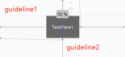
Guideline
// Guildline 像辅助线一样,在预览的时候帮助你完成布局(不会显示在界面上)。
android:orientation // 垂直vertical,水平horizontal
layout_constraintGuide_begin // 开始位置
layout_constraintGuide_end // 结束位置
layout_constraintGuide_percent // 距离顶部的百分比(orientation = horizontal时则为距离左边)

<android.support.constraint.Guideline
    android:id="@+id/guideline1"
    android:layout_width="wrap_content"
    android:layout_height="wrap_content"
    android:orientation="horizontal"
    app:layout_constraintGuide_begin="50dp" />

<android.support.constraint.Guideline
    android:id="@+id/guideline2"
    android:layout_width="wrap_content"
    android:layout_height="wrap_content"
    android:orientation="vertical"
    app:layout_constraintGuide_percent="0.5" />
guideline1 为水平辅助线,开始位置是距离顶部 50dp,guideline2 位垂直辅助线,开始位置为屏幕宽的 0.5 (中点位置),效果如下:
8 百分比布局
百分比布局只提供了 PercentFrameLayout 和 PercentRelativeLayout 两个布局。
引入包:
implementation "androidx.percentlayout:percentlayout:1.0.0"
编写布局:
<?xml version="1.0" encoding="utf-8"?>
<androidx.percentlayout.widget.PercentFrameLayout xmlns:android="http://schemas.android.com/apk/res/android"
    xmlns:app="http://schemas.android.com/apk/res-auto"
    android:layout_width="match_parent"
    android:layout_height="match_parent">

    <Button
        android:id="@+id/button1"
        android:layout_gravity="left|top"
        android:text="button 1"
        app:layout_heightPercent="50%"
        app:layout_widthPercent="50%" />

    <Button
        android:id="@+id/button2"
        android:layout_gravity="right|top"
        android:text="button 2"
        app:layout_heightPercent="50%"
        app:layout_widthPercent="50%" />

</androidx.percentlayout.widget.PercentFrameLayout>
9 自定义布局
9.1 引入布局
title.xml
<?xml version="1.0" encoding="utf-8"?>
<LinearLayout xmlns:android="http://schemas.android.com/apk/res/android"
    android:layout_width="match_parent"
    android:layout_height="wrap_content"
    android:background="@drawable/title_bg">

    <Button
        android:id="@+id/title_back"
        android:layout_width="wrap_content"
        android:layout_height="wrap_content"
        android:layout_gravity="center"
        android:layout_margin="5dp"
        android:background="@drawable/back_bg"
        android:text="Back"
        android:textColor="#fff" />

    <TextView
        android:id="@+id/title_text"
        android:layout_width="0dp"
        android:layout_height="wrap_content"
        android:layout_gravity="center"
        android:layout_weight="1"
        android:gravity="center"
        android:text="Title Text"
        android:textColor="#fff"
        android:textSize="24sp" />

    <Button
        android:id="@+id/title_edit"
        android:layout_width="wrap_content"
        android:layout_height="wrap_content"
        android:layout_gravity="center"
        android:layout_margin="5dp"
        android:background="@drawable/edit_bg"
        android:text="Edit"
        android:textColor="#fff" />

</LinearLayout>
<?xml version="1.0" encoding="utf-8"?>
<LinearLayout xmlns:android="http://schemas.android.com/apk/res/android"
    android:layout_width="match_parent"
    android:layout_height="match_parent" >

    <include layout="@layout/title" />
</LinearLayout>
9.2 自定义布局
当我们想要在多个界面引入此布局,并且所引入的布局需要做一些统一的操作,比如 左上角一直是返回上一个 activity,这时候,就不适合引入布局,如果使用引入布局,我们需要在每个新的布局中进行点击事件的监听,我们采用自定义布局。
public class TitleLayout extends LinearLayout {

    public TitleLayout(Context context, AttributeSet attrs) {
        super(context, attrs);
        // 将 title 作为此布局的子项
        LayoutInflater.from(context).inflate(R.layout.title, this);
        Button titleBack = (Button) findViewById(R.id.title_back);
        titleBack.setOnClickListener(new OnClickListener() {
            @Override
            public void onClick(View v) {
                ((Activity) getContext()).finish();
            }
        });
    }

}
<?xml version="1.0" encoding="utf-8"?>
<LinearLayout xmlns:android="http://schemas.android.com/apk/res/android"
    android:layout_width="match_parent"
    android:layout_height="match_parent" >

    <com.example.uicustomviews.TitleLayout
        android:layout_width="match_parent"
        android:layout_height="wrap_content" />

</LinearLayout>